


Every field service manager I meet tracks too many metrics. Dashboards showing average speed between stops, how many times techs opened the knowledge base, job type breakdowns by zip code. Meanwhile the actual operation keeps missing SLAs, burning through parts inventory, and watching good technicians quit after six months.
The problem isn't tracking metrics. It's tracking the wrong ones, at the wrong level, with zero connection between what dispatchers see daily and what executives review quarterly.
After building operational software for field service companies ranging from 8-person HVAC shops to 200-tech commercial equipment dealers, one pattern keeps coming up: the businesses that actually improve have figured out which metrics matter for each role and how those metrics cascade up and down the org. Everyone else is just collecting data.
The hierarchy nobody actually builds
Most field service operations treat KPIs like a buffet—everyone grabs what looks good. Your dispatcher watches job completion rates while your CFO obsesses over revenue per tech. Neither metric helps the other person make better decisions.
What works is a prioritized hierarchy where each role tracks 3-5 primary metrics that directly influence the level above and below them. A chain of operational decisions, not isolated scorecards.
A commercial refrigeration company had 47 different metrics scattered across spreadsheets and systems after eighteen months of dashboard chaos. Managers spent hours generating reports nobody read. Dispatchers ignored their dashboards because the numbers didn't help them make routing decisions. Technicians had no visibility into anything beyond their daily schedule.
They rebuilt around a simple structure:
-
Technicians track metrics that help them complete jobs efficiently
-
Dispatchers track metrics that optimize daily operations
-
Managers track metrics that improve weekly/monthly performance
-
Executives track metrics that drive quarterly/annual strategy
Sounds obvious. Most companies do the opposite—they push executive metrics down to everyone or create separate silos where nobody's numbers connect.
Technician-level metrics that actually matter
Technicians need metrics they can influence during their workday. Not quarterly revenue targets or customer satisfaction scores from three months ago.
Eliminate field service chaos with Romrly.
Romrly helps you assign, track, and complete service jobs efficiently and on time.
- Unified job scheduling
- Technician dispatch & tracking
- Customer notifications & updates
No credit card required
Primary technician KPIs:
| Primary technician KPIs |
|---|
| First-time fix rate (target: 75-85% depending on equipment complexity) Measured daily, visible on mobile. Technicians see their rolling 7-day average every morning. This one metric impacts customer satisfaction and operational costs more than almost anything else at the field level. |
| Parts usage variance (target: within 10% of estimate) Actual parts used versus estimated parts per job type. Technicians consistently running 40% over estimate either lack training or are dealing with recurring equipment issues nobody's documenting properly. |
| Job completion time vs estimate (target: within 15% window) Not about rushing—about accuracy. If preventive maintenance on a specific chiller model consistently takes 3 hours instead of the estimated 2, either the estimate is wrong or there's a knowledge gap that needs addressing. |
| Daily utilization (target: 70-80% productive time) Productive hours divided by paid hours, excluding drive time. Below 70% usually points to scheduling problems. Above 80% starts burning people out. |
Surface the rolling 7-day first-time fix rate on the mobile home screen so technicians see immediate feedback after each job.
One HVAC company tracked these on simple mobile dashboards that updated after each job. Technicians could see their metrics shifting throughout the day instead of getting blindsided at monthly reviews. Their first-time fix rate went from 67% to 79% in four months—mostly because technicians finally understood what was actually affecting their numbers.
Dispatcher metrics that prevent firefighting
Dispatchers live in the moment. Hundreds of micro-decisions a day. Their metrics need to reflect immediate operational health while feeding upward into the management view.
Primary dispatcher KPIs:
Same-day schedule completion (target: 92-95%) Jobs completed versus jobs scheduled at shift end. Consistently missing this usually means poor capacity planning or technician productivity issues—sometimes both.
SLA compliance rate (target: varies by contract tier) Percentage of jobs started within the promised timeframe, tracked by contract type. A medical equipment servicer found they were treating all SLAs equally, causing premium contract violations while over-servicing standard accounts. Segmentation fixed it.
Emergency response time (target: under 2 hours for P1 issues) From ticket creation to technician arrival on critical calls. This feeds directly into customer retention metrics at the management level.
Schedule density (target: 6-8 jobs per tech per day, varies by job type) Too low means wasted capacity. Too high means rushed work and callbacks.
Unassigned job backlog (target: less than next-day capacity) Growing backlog is a capacity problem management needs to know about before it becomes a crisis.
A dispatcher at a commercial appliance repair company cut their emergency response time by nearly 45 minutes just by having real-time visibility into these metrics. They noticed patterns—Tuesdays always had more emergencies, certain zip codes clustered failures—and started pre-positioning technicians accordingly.
Management metrics that drive improvement
Managers need weekly and monthly views that surface trending problems before they become crises. Their metrics should trigger specific operational adjustments, not just generate reports for executives.
Primary management KPIs:
Weekly revenue per available tech hour (target: depends on market/service type) Total service revenue divided by total available technician hours. Declining trend usually means a pricing, productivity, or scheduling issue—sometimes all three.
Customer callback rate (target: under 5%) Jobs requiring return visits within 30 days, segmented by job type and technician. One facilities maintenance company found a single equipment type generating 23% of their callbacks. Turned out they needed specialized training for that manufacturer's units.
Technician productivity trend (target: steady or improving) Week-over-week change in completed jobs per tech, normalized for job complexity. Sudden drops often signal training gaps, tool problems, or morale issues worth investigating.
Parts availability impact (target: less than 3% jobs delayed) Jobs delayed or incomplete due to parts unavailability. Feeds directly into inventory planning and vendor decisions.
Contract retention rate (target: 90%+ annually) Measured monthly, acted on weekly. One commercial HVAC company noticed retention dropping in specific building types before they understood why—their techs weren't properly trained on newer VRF systems in those facilities.
Every metric here should point toward a specific lever managers can pull. Callback rate climbing? Check training and QA. Revenue per hour dropping? Review pricing and schedule density.
The wiring that makes it work
Having the right metrics means nothing if they don't connect. Here's how the companies that actually improve wire their KPI framework:
Daily cascade meetings:
-
7 AM
Dispatchers review previous day's completion rate and today's schedule density
-
7
15 AM: Brief technicians on their personal metrics and team targets
-
4 PM
Dispatchers compile daily metrics for management review
Weekly management reviews:
-
Monday morning
Review previous week's aggregated dispatcher metrics
-
Identify patterns requiring intervention
-
Adjust resource allocation for the current week
Monthly executive dashboards:
-
Aggregate management metrics into strategic indicators
-
Revenue per customer trending
-
Market segment performance
-
Expansion or contraction signals
The feedback loop most companies miss:
Executive decisions need to cascade down through adjusted targets. If executives decide to focus on contract growth, management adjusts technician utilization targets to allow more time for relationship building. Dispatchers modify schedule density accordingly. Technicians see updated job time estimates that reflect the new priority. Without that loop, everyone's optimizing for different things.
Here's a simple visual of that cascade.
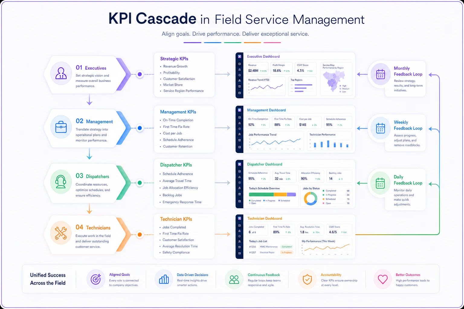
An industrial equipment servicer implemented this cascade after years of disconnected metrics. Within six months: emergency response times down 31%, contract retention at 94%, revenue per tech hour up $27. Not from any dramatic operational overhaul—just from getting everyone's metrics pointed at the same goals.
Dashboard layouts that prevent information overload
The best dashboard shows exactly what someone needs to make their next decision. Nothing more.
Technician mobile dashboard:
-
Top row
Today's personal metrics (fix rate, utilization, time variance)
-
Middle
Current job details and next job preview
-
Bottom
Quick input buttons for job status and parts used
-
Updates after each job completion
Dispatcher command center:
-
Left panel
Real-time schedule grid with drag-and-drop capability
-
Center
Map view with technician positions and job locations
-
Right panel
Unassigned job queue sorted by priority
-
Top bar
Live metrics (completion rate, SLA status, emergency queue)
-
Updates every 60 seconds
Management weekly view:
-
Page 1
Trend lines for all primary metrics (week-over-week)
-
Page 2
Technician performance matrix (sortable by any metric)
-
Page 3
Customer segment analysis (callbacks, response times by contract type)
-
Page 4
Action items generated from metric triggers
Executive quarterly dashboard:
-
Single page with 6-8 strategic metrics
-
Year-over-year growth comparisons
-
Competitive positioning indicators
-
Resource utilization versus market opportunity
One commercial fire suppression company spent $45,000 on dashboard software displaying 200+ metrics across dozens of screens. Nobody used it. They rebuilt in basic spreadsheet software with automated data feeds. Adoption hit close to 100% within two weeks because people could actually find what they needed.
Timeframe alignment prevents confusion
Different roles need different time horizons for the same metric. First-time fix rate means something different when viewed daily versus quarterly.
Technician timeframes:
-
Real-time
Current job status
-
Daily
Personal performance metrics
-
Weekly
Trending indicators for self-improvement
Dispatcher timeframes:
-
Real-time
Schedule adherence and technician location
-
Hourly
SLA countdown timers
-
Daily
Completion rates and backlog status
Management timeframes:
-
Daily
Exception alerts (missed SLAs, unusual callback spikes)
-
Weekly
Performance trends and resource allocation
-
Monthly
Strategic metric review and goal adjustment
Executive timeframes:
-
Monthly
High-level performance indicators
-
Quarterly
Strategic goal progress
-
Annual
Market position and growth metrics
If technicians see daily metrics but get evaluated on monthly averages they can't access, trust erodes fast. If dispatchers optimize for daily completion while management rewards weekly revenue, you get conflict. Consistency across timeframes matters more than most people realize.
Vanity metrics that waste everyone's time
Some metrics sound important and provide zero operational value.
"Customer satisfaction score" without segmentation A blended satisfaction score tells you nothing actionable. Break it down by service type, technician, response time, and contract tier—or don't bother tracking it.
"Average drive time" without context Meaningless unless compared to optimal routing. A dispatcher can't improve a number they can't influence through better decisions.
"Total jobs completed" without complexity weighting Replacing an air filter isn't the same as rebuilding a compressor. Raw job counts encourage cherry-picking easy work.
"Revenue per customer" without profitability That customer generating $50,000 annually might cost $48,000 to service. Track gross margin per customer instead.
"Technician certification count" without utilization Ten certified techs means nothing if only three regularly do that work. Track certification utilization rate instead.
A facilities management company tracked "app usage time" thinking it showed technician engagement. Their top performers spent the least time in the app because they knew exactly where to find what they needed. The metric was rewarding inefficiency.
Real-world implementation sequence
Rolling out a proper KPI framework takes roughly 90 days if you're disciplined about the sequence:
Days 1-30: Foundation
-
Audit current metrics (you'll probably find 50+ across various systems)
-
Identify which decisions each role actually makes daily
-
Map 3-5 primary metrics per role
-
Cut every vanity metric
Days 31-60: Wiring
-
Build simple dashboards—don't over-engineer
-
Establish data collection processes
-
Create cascade meeting structure
-
Train each role on their specific metrics
Days 61-90: Refinement
-
Gather feedback on metric usefulness
-
Adjust targets based on baseline data
-
Connect metric triggers to operational responses
-
Document the feedback loop between levels
An electrical contractor with 45 technicians tackled this after years of managing 18 spreadsheets and three software systems that didn't talk to each other. They started with just dispatcher metrics the first month, added technician metrics in month two, management metrics in month three.
By month four, the operation ran more smoothly than it had in years. Not because they suddenly became great at their jobs—because everyone finally knew what "good" looked like for their specific role.
When automation amplifies a good framework
A well-structured KPI framework gets meaningfully more powerful when you remove the manual data collection burden. AI-powered operational software can automatically pull metrics from multiple sources—job completion times from mobile apps, SLA compliance from ticketing systems, parts usage from inventory management—and populate role-specific dashboards without anyone manually entering anything.
The other piece is real-time alerting. Instead of discovering problems during weekly reviews, managers get notified when callback rates spike or schedule completion drops mid-week. Dispatchers can receive pattern-based suggestions when the system spots conditions that historically led to missed SLAs.
AI automation also catches correlations that are easy to miss manually. Maybe callbacks spike when specific technicians work certain equipment types. Maybe Tuesday morning emergencies trace back to maintenance skipped the previous Thursday. These patterns only surface when clean data flows automatically into a properly structured framework—not when someone's copying numbers between spreadsheets.
Making metrics drive actual improvement
The best field service KPI framework I've come across belonged to a 12-person plumbing company. Eleven metrics total across all roles. Every metric had a clear owner, a specific target, and a documented response plan for when it drifted outside range.
Their secret wasn't sophisticated software. They just made sure every number on every dashboard answered one question: what should I do differently today based on this?
If a metric doesn't change someone's daily decisions, it doesn't belong on their dashboard. If a target doesn't trigger a specific operational response, it's just a number taking up space. And if the metrics at different organizational levels don't connect, you're running separate businesses that share a logo.
Start with the decisions each role makes. Build metrics that inform those decisions. Wire them together so improvements cascade through the organization. Keep it simple enough that everyone understands their numbers—and complex enough that the connections actually drive operational change.
Most field service operations don't need more metrics. They need the right ones, properly prioritized, clearly owned, and tightly connected. Get that right and improvement follows. Keep chasing vanity metrics and dashboard overload, and you'll be fighting the same fires next year.
Most field service operations don't need more metrics. They need the right ones, properly prioritized, clearly owned, and tightly connected. Get that right and improvement follows. Keep chasing vanity metrics and dashboard overload, and you'll be fighting the same fires next year.
The difference between field service companies that scale past 20 technicians and those that stall usually comes down to this: the ones that grow know exactly which numbers matter for each role and how those numbers connect to drive the business forward. Everyone else is just collecting data and hoping something changes.
Ready to optimize your field operations?
Join 2,000+ service teams using Romrly to boost productivity, reduce downtime, and enhance customer satisfaction.