

Most territory maps get drawn once — usually by whoever founded the company or whoever knew the region best — and then stay frozen while everything around them changes. New customers sign in the dense downtown core. A big contract lands 40 miles out. Two technicians quit, one moves, and suddenly the map that made sense three years ago is quietly costing you SLA credits and burning out half your crew.
The frustrating part is that bad territories rarely announce themselves. They hide inside metrics that look fine on average. Your overall on-time rate is 91%, so nobody panics — but one region is running at 78% while another sits at 98% with technicians finishing early. Averages smooth over exactly the problems territory design is supposed to solve.
This is a systems article, not a list of mapping tricks. The goal is to cover what a canonical territory-design system actually looks like: the data you need before you draw a single boundary, how to translate SLAs into a heatmap, how to build honest workload maps, how often to rebalance, and — maybe most important — the guardrails that stop well-meaning manual edits from wrecking the whole thing.
Why territory design breaks (and why it breaks quietly)
Territories fail for a predictable reason: they're designed around geography instead of around workload and promises.
Geography feels intuitive. Draw a clean line down the highway, hand each side to a technician, done. But a square mile downtown might hold 60 service points with tight 4-hour SLAs, while a square mile in the exurbs holds three accounts with next-day windows. Equal area is almost never equal work. When you split by map instead of by demand, you build imbalance into the system on day one. Then scale makes it worse. This usually shows up when a company grows from one metro to two or three regional footprints. The original territory logic — informal, tribal, "Dave handles the north" — doesn't transfer. Each region invents its own rules. One splits by zip code, another by customer size, another by whoever's closest that morning. Now you have three incompatible systems and no way to compare performance across them or shift load during a surge.
A few patterns show up repeatedly:
-
SLA blindness. Boundaries get drawn without any reference to response-time commitments, so premium contracts end up in the same bucket as best-effort ones.
-
Phantom balance. The map looks even, but drive time, job duration, and appointment density are wildly different across zones.
-
Edit creep. Dispatchers quietly reassign accounts to smooth out today's chaos, and those temporary fixes calcify into permanent, undocumented territory changes.
-
No cadence. Nobody owns rebalancing, so it only happens in a crisis — usually after a customer has already escalated.
The through-line: territory design gets treated as a one-time drawing exercise instead of a living operational system tied to demand and SLAs.
The data you need before you draw anything
You can't design good territories from intuition, and you can't design them from an address list alone. A canonical system needs a specific set of inputs, and the quality of your territories will never exceed the quality of these feeds.
Eliminate field service chaos with Romrly.
Romrly helps you assign, track, and complete service jobs efficiently and on time.
- Unified job scheduling
- Technician dispatch & tracking
- Customer notifications & updates
No credit card required
Here's the minimum data foundation:
| Data input | Why it matters | Common gap |
|---|---|---|
| Service point locations (geocoded) | The raw demand map | Addresses stored as free text, not coordinates |
| SLA tier per account | Turns commitments into constraints | SLAs live in contracts, not the dispatch system |
| Historical job frequency per site | Real demand, not assumed demand | Only "active" accounts counted; seasonal work missed |
| Average job duration by type | Workload ≠ job count | Everything treated as a flat 1-hour visit |
| Travel time matrix (not distance) | 12 miles downtown ≠ 12 miles rural | Straight-line distance used instead of drive time |
| Technician skills & certifications | Some work can't go to just anyone | Skills tracked in someone's head |
| Technician home base / start point | Anchors realistic routing | Everyone assumed to start from the shop |
The two inputs people skip most often are job duration and travel time. Both quietly destroy territory balance. If you count jobs but ignore that HVAC installs run 4 hours and filter swaps run 20 minutes, your "balanced" territories aren't. And if you measure distance instead of actual drive time, you'll overload an urban technician who can't physically hit the volume because every trip eats 35 minutes in traffic.
One more thing worth stressing: this data has to be clean and connected before it's useful. If your service points, SLAs, and job history live in three disconnected spreadsheets, you'll spend more time reconciling data than designing territories. This is exactly where a solid underlying data model pays off — everything downstream depends on it.
SLA heatmapping: making promises visible on the map
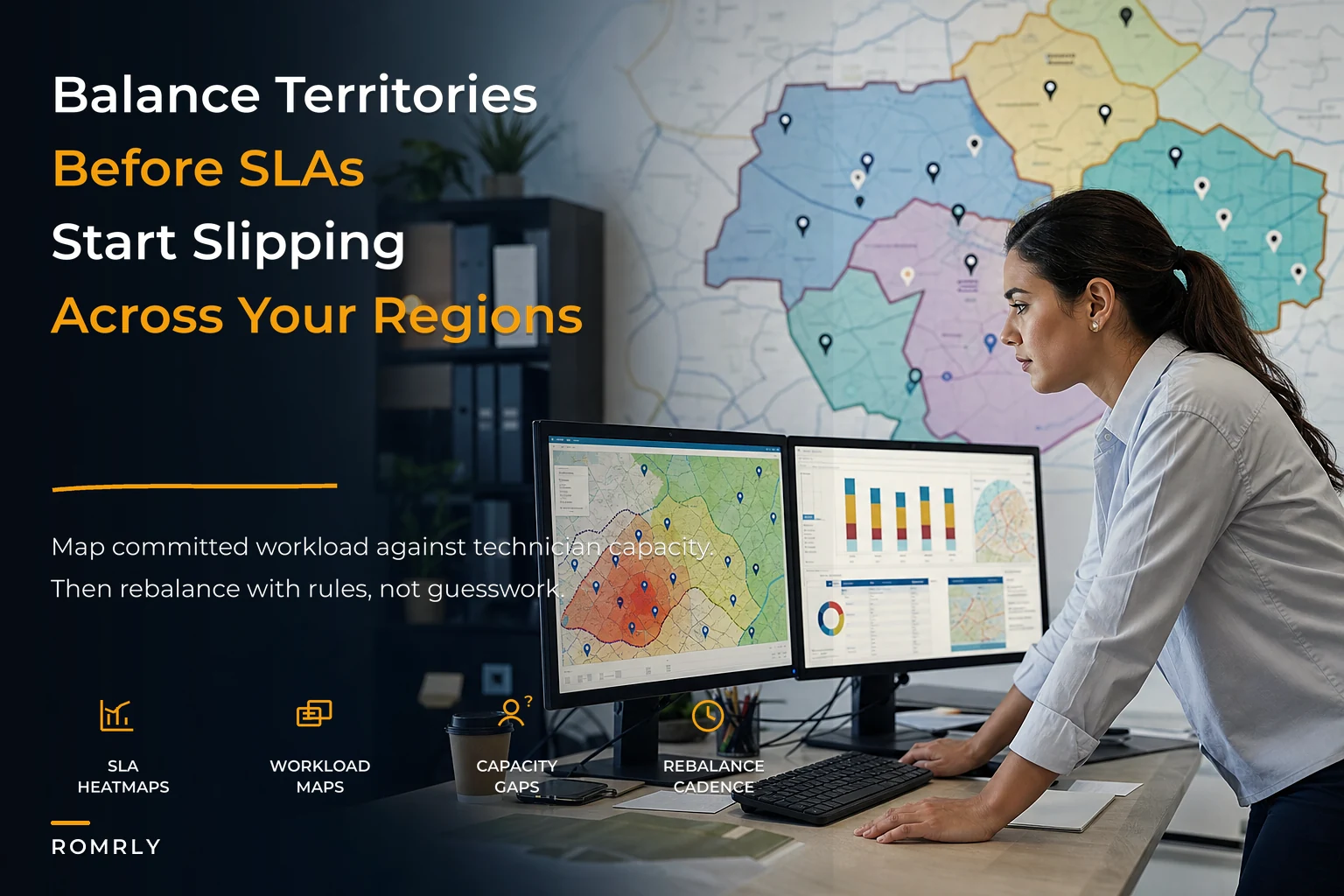
Once your data is in place, the first real design step is an SLA heatmap. This is where you overlay your response-time commitments onto geography and see where the pressure actually concentrates.
The idea is simple. Assign each service point a color-weighted value based on its SLA tier — 4-hour emergency response gets the highest weight, next-day gets medium, scheduled or best-effort gets the lowest. Then plot density. What emerges is a map showing not where your customers are, but where your obligations are.
The insight most managers miss: SLA pressure and customer density rarely line up. You'll often find a pocket of high-SLA accounts sitting outside your dense core — a cluster of premium clients in a suburban business park, 25 minutes from your nearest technician. On a pure customer-count map, that pocket looks trivial. On an SLA heatmap, it lights up, because a single 4-hour breach there costs real credits and a hard conversation.
A useful heatmap distinguishes three things at once:
-
Density of high-tier SLAs — where your riskiest promises cluster.
-
Distance from nearest qualified technician — response feasibility.
-
Historical breach hotspots — where you've actually missed, not where you theoretically might be.
That third layer matters. Theory says the far-flung premium cluster is risky. History tells you whether it's actually biting you or whether your team has quietly figured out how to cover it. Design to the reality first.
Building honest workload maps
SLA heatmapping tells you where the pressure is. Workload maps tell you whether your people can actually absorb it.
A workload map converts everything into a single currency: committed hours per period, per territory. Not job counts. Hours. And it has to include travel, because for most field teams, travel is 25–40% of the working day.
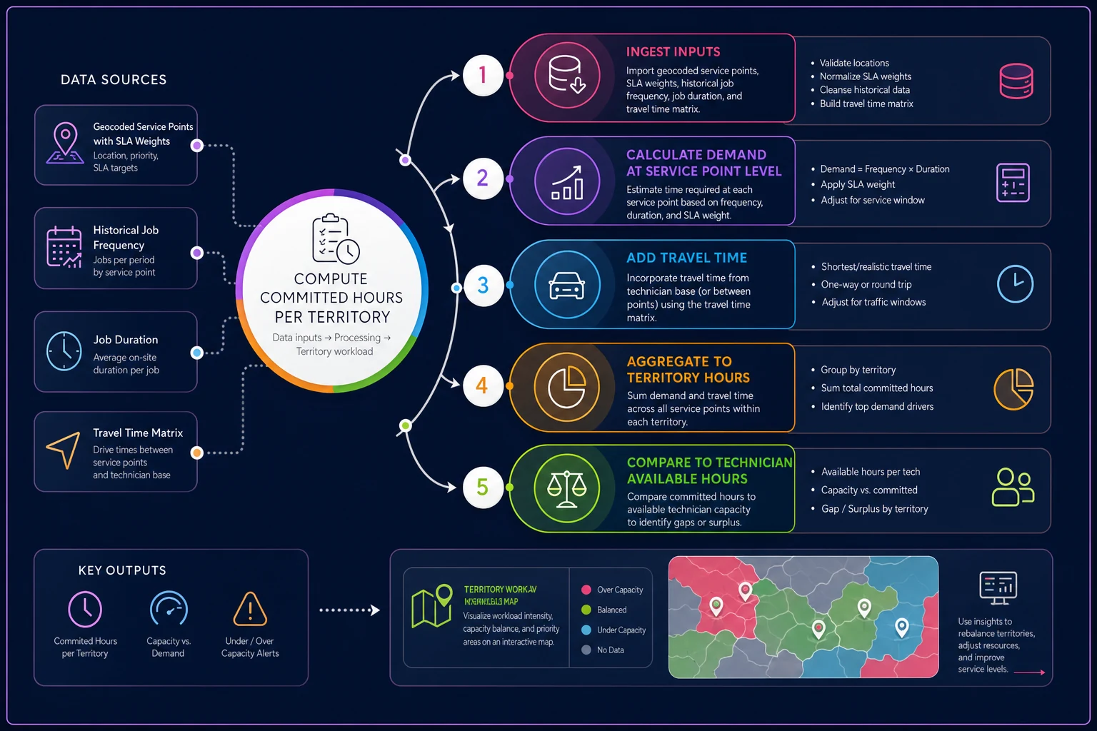
The workflow in plain terms: for each service point, take its historical job frequency, multiply by the average duration of the work that happens there, and add the expected travel time to reach it from its likely route position. Sum that across every point in a proposed territory over a typical week and you get the true weekly workload for that zone. Compare it against the realistic available hours of the assigned technician — after subtracting PTO buffer, admin time, and a reserve for emergencies.
A typical example: two territories each have roughly 45 recurring accounts, so on paper they look identical. But Territory A is dense urban work — short jobs, short hops — totaling around 32 committed hours a week. Territory B is spread across rural routes with longer installs and 40-minute drives between stops, totaling closer to 46 hours. Same account count, wildly different load. Without a workload map, you'd never see it, and Territory B's technician would slowly fall behind, breach a few SLAs, and eventually quit — and everyone would blame the technician.
The uncomfortable truth workload maps reveal: the technician who complains isn't always the overloaded one, and the one who's silent isn't always fine. Some people absorb overload until they break. Map the hours, not the vibes.
If you want to go deeper on how demand translates into staffing and crew mix, it's worth pairing territory work with a broader operator-facing capacity system, since territories and capacity planning are really two views of the same demand.
Rebalancing cadence: how often, and what triggers it
Territories drift. Customers churn, new contracts land, technicians come and go. The question isn't whether to rebalance — it's on what schedule and against what triggers, so you're not doing it reactively at 6am on the worst morning of the quarter.
A canonical system uses two kinds of rebalancing: scheduled and triggered.
Scheduled rebalancing runs on a fixed cadence — usually quarterly for stable businesses, monthly for fast-growing or seasonal ones. This is the deliberate, low-drama review where you re-run the workload maps against current data and make measured adjustments.
Triggered rebalancing kicks in when a threshold gets crossed between scheduled reviews. Sensible triggers include:
-
A territory's committed hours exceed available hours by more than ~15% for two consecutive weeks.
-
SLA breach rate in a zone climbs above your tolerance (say 5%) for a full month.
-
A technician leaves and their accounts need principled redistribution rather than a scramble.
-
A new contract adds enough load to tip a territory over its buffer.
The mistake is running rebalancing too often. Every reassignment has a cost: customers lose their familiar technician, technicians lose route knowledge, and first-time-fix rates dip while people relearn accounts. Constant tinkering feels responsive but quietly erodes the relationship equity that makes field service work. Rebalance with intent, on a cadence, against clear triggers — not every time someone has a bad week.
Manual-adjustment guardrails (the part everyone ignores)
This is where most territory systems die. You build a clean, data-driven model, roll it out, and within a month dispatchers have manually overridden a third of it to handle daily reality. That's not wrong — day-of reality needs flexibility. The problem is when temporary overrides silently become permanent, undocumented territory changes that nobody designed.
The fix is drawing a hard line between routing decisions and territory decisions.
Routing is day-of. Moving a job to a closer technician because of traffic, an emergency, or a no-show is normal and healthy — that's exactly the kind of controlled flexibility a good dispatcher decision framework is built for. Those moves should expire at end of day and never alter the underlying territory.
Territory changes are structural. Permanently reassigning an account from one zone to another is a design decision, and it needs guardrails:
-
Every permanent reassignment requires a reason code — capacity, skill match, customer request, geographic logic.
-
Changes above a threshold (say, moving more than 3 accounts or shifting more than ~10% of a territory's hours) require manager sign-off.
-
Manual edits are logged with who, when, and why so drift is visible and reversible.
-
A monthly audit compares the "as-designed" territory to the "as-operating" reality, flagging accounts that migrated without approval.
Automating the monthly as-designed vs. as-operating diff makes drift visible without adding manual auditing burden.
The single most valuable guardrail is that last one — the as-designed vs. as-operating comparison. Without it, you have no idea how far your live operation has drifted from your model. This gap can reach 20–30% within a year, entirely through small edits that seemed reasonable in the moment and that nobody ever rolled back.
Decision tables with worked examples
Territory decisions get made faster and more consistently when you replace judgment calls with decision tables. Here's a simplified reassignment table you can adapt:
| Situation | Territory over 15% capacity? | High-SLA account? | Qualified tech nearby? | Action |
|---|---|---|---|---|
| Routine overload | Yes | No | Yes | Reassign lowest-SLA accounts to neighbor |
| Premium account at risk | Yes | Yes | Yes | Move premium account first, protect SLA |
| Overload, no nearby capacity | Yes | Either | No | Escalate: add capacity or renegotiate window |
| Underloaded territory | No (under) | Either | N/A | Absorb accounts from adjacent overloaded zone |
| Skill mismatch | No | Either | No (skill gap) | Reassign by certification, not geography |
Footprint 1: Single dense metro. One technician's downtown territory hits 48 committed hours against 40 available — clearly over. Most of the overload is low-SLA scheduled maintenance. The table says: reassign the lowest-SLA accounts to the neighboring zone, which is running at 33 hours. Both zones land near 40, no premium work is touched, no SLA risk introduced.
Footprint 2: Metro plus satellite towns. The problem here is a cluster of 4-hour-SLA accounts in a satellite town, 35 minutes from the metro core. The workload map shows the town doesn't justify a dedicated technician — only about 18 hours of work — but the SLA heatmap shows real breach risk. The table pushes toward escalation: either designate a partial-week presence in the satellite or renegotiate those windows to next-day where the customer allows. Geography alone would've said to lump the town into the nearest zone. The SLA layer says not to.
Footprint 3: Three regions, shared border. Two adjacent regions share a boundary where accounts have been drifting for months via manual edits. The as-designed vs. as-operating audit surfaces roughly 14 accounts that moved without sign-off, pushing one region 22% over capacity while the other sits underloaded. The decision table treats this as a structural rebalance, not a routing fix: absorb accounts into the underloaded zone, apply reason codes, reset the baseline. Without the audit, this imbalance stays invisible behind a healthy-looking regional average.
When this level of rigor makes sense — and when it doesn't
A full canonical territory system is real work to build and maintain. It's not always the right investment.
When it makes sense:
-
You operate across multiple regions or metros and need comparable, transferable logic.
-
SLA credits or penalties are large enough to hurt.
-
You're growing fast enough that last year's map is already wrong.
-
You have enough technicians — roughly 8 or more — that imbalance can't be smoothed over by everyone just pitching in.
When it's overkill:
-
You run a small, single-region team where the manager knows every account personally. Formal heatmaps and audit cadences add overhead you don't need yet.
-
Your work is almost entirely scheduled with generous windows and no meaningful SLA penalties. Balance still matters, but the SLA-heatmap layer buys you little.
Who should not start here: if your underlying data is a mess — addresses as free text, SLAs buried in PDFs, job history nobody trusts — don't build territory logic on top of it. Fix the data foundation first. Territory design amplifies whatever data quality you feed it, good or bad.
A short real scenario
A regional plumbing and drain company running three footprints had a company-wide on-time rate around 90% — fine on paper. But one region was quietly breaching 4-hour emergency SLAs on roughly 1 in 6 calls, mostly in a suburban corridor that had grown fast without anyone redrawing the map. Two technicians in that region were routinely working 46–50 hour weeks; two others in an adjacent region were finishing early most days.
They ran the exercise properly: geocoded every service point, tagged SLA tiers, built travel-time-based workload maps, and produced an SLA heatmap that immediately lit up the suburban corridor. The workload map confirmed a roughly 12-hour weekly gap between the overloaded and underloaded pairs. The fix wasn't dramatic. They reassigned about 15 accounts across the border, moved two high-SLA clusters closer to qualified technicians, and set a quarterly rebalancing cadence with an as-designed vs. as-operating audit. Over the next couple of months, the problem region's SLA breach rate dropped from roughly 16% to under 6%, and the weekly-hours spread between technicians narrowed to something that no longer looked like a resignation waiting to happen. Same headcount, same trucks — just a map that finally matched the work.
Bringing it together
Territory design isn't a map. It's a system that connects your SLA commitments, your real demand, your travel realities, and your people — and then keeps them aligned as all four keep changing. The businesses that get this right treat the map as a living model with clear inputs, a rebalancing cadence, and guardrails that keep daily flexibility from quietly rewriting the design.
The pieces reinforce each other. Good workload maps depend on clean data. Rebalancing depends on honest workload maps. Guardrails depend on being able to compare the design to reality. And all of it ties back to the broader picture of capacity and inventory — because a well-balanced territory still fails if the technician shows up without the right parts, which is its own forecasting and stocking problem worth solving alongside this.
Start with the data. Make your SLAs visible on the map. Measure workload in hours, not job counts. Rebalance on a cadence, not in a panic. And put guardrails around manual edits before they quietly undo everything you designed.
Start with the data. Make your SLAs visible on the map. Measure workload in hours, not job counts. Rebalance on a cadence, not in a panic. And put guardrails around manual edits before they quietly undo everything you designed.
Ready to optimize your field operations?
Join 2,000+ service teams using Romrly to boost productivity, reduce downtime, and enhance customer satisfaction.